Show case text

Keeping It Simple.
Making It Better.
Keeping It Simple.
Making It Better.
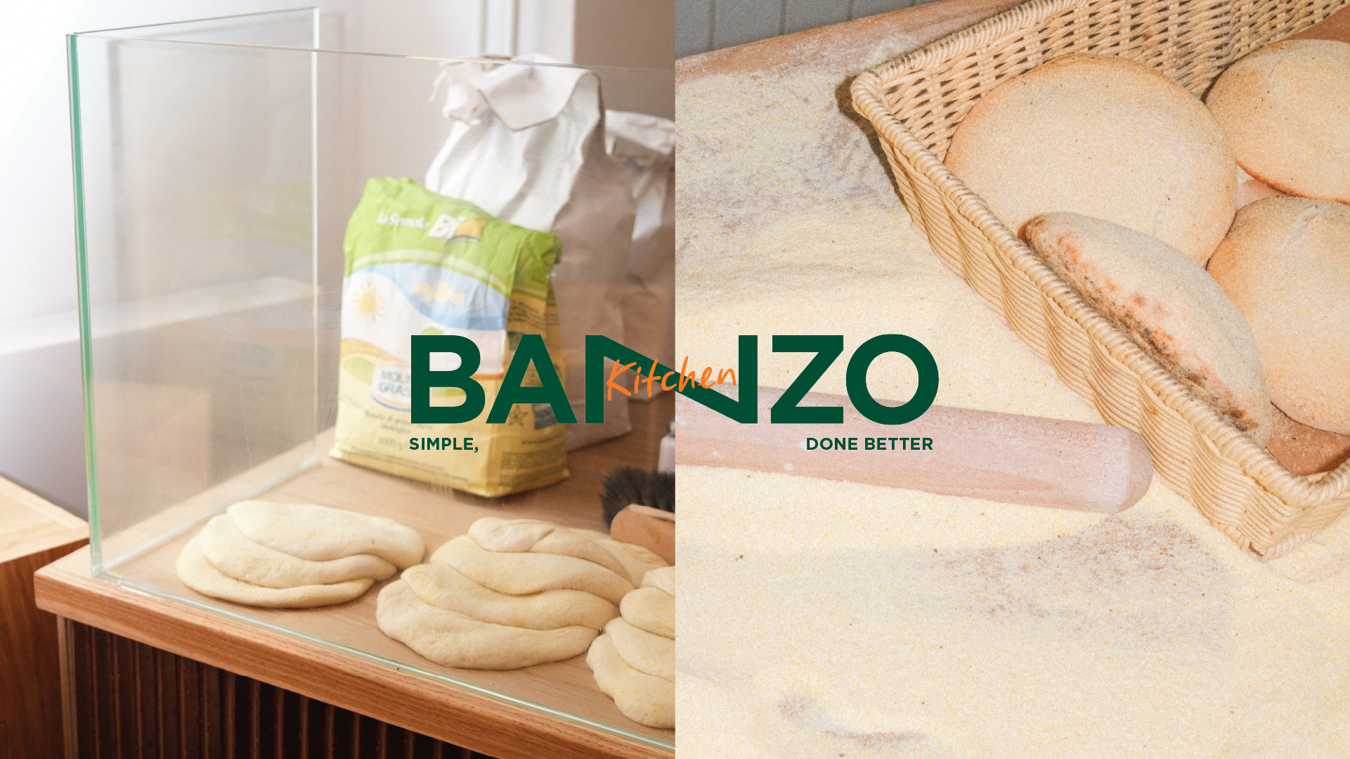
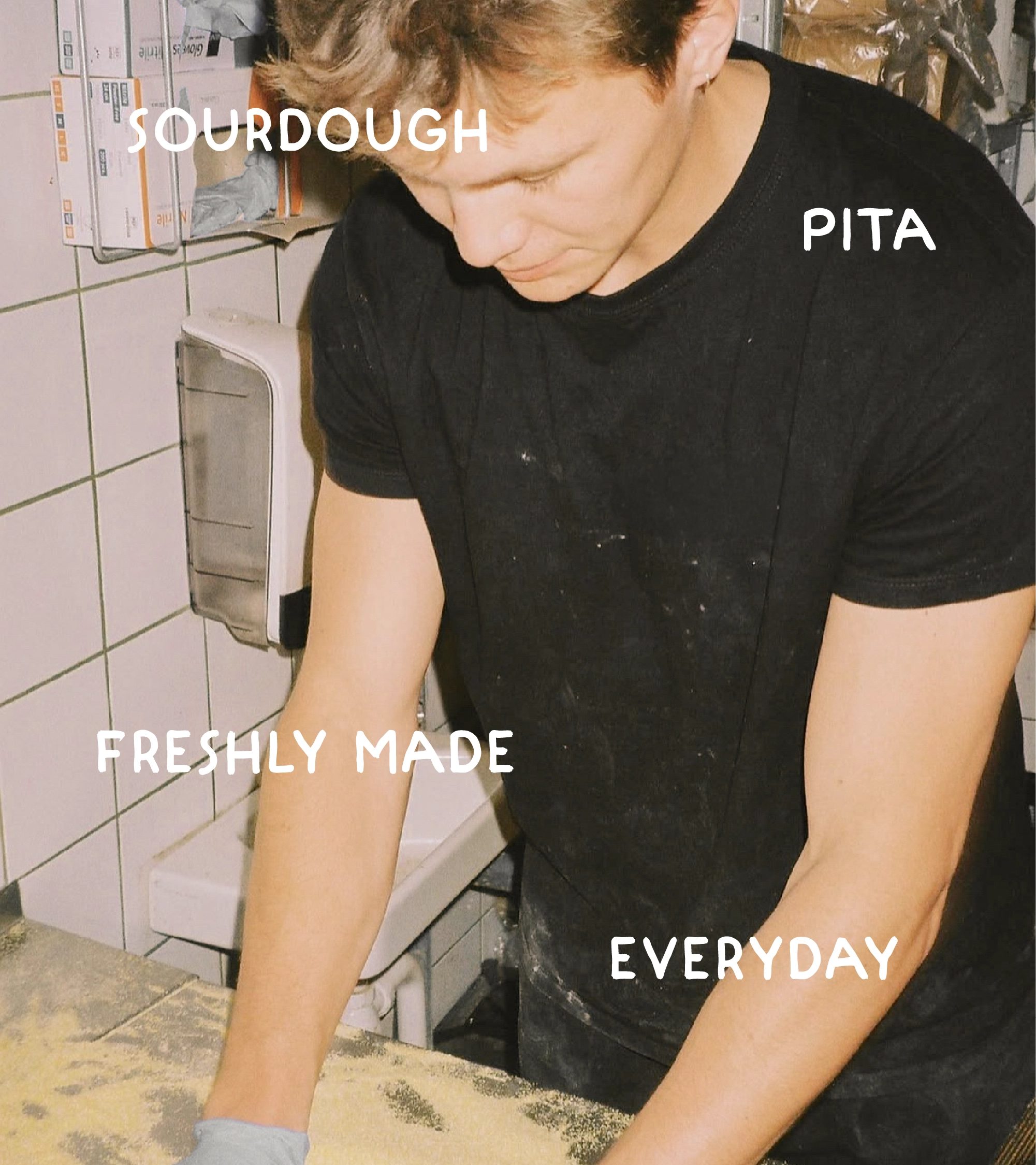
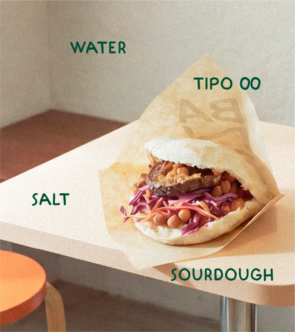
Banzo started with a simple idea: take the basics and make them better. Fresh dough, baked in-house and filled with real flavour. Every morning begins hours before opening, with the same focus on freshness, simplicity and doing things properly. But as the business evolved from freshly baked pita to sourdough pita, the brand needed an identity that could evolve with it.
We identified a core challenge. The food had a clear point of view, but the brand needed to feel just as fresh, considered and distinctive. In the growing fast-casual space, where brands compete not only on taste but on experience, the identity needed to create an immediate sense of energy and appetite without losing the simplicity at the heart of Banzo.
The first step was the name. Previously known as Garbanzo, the brand needed something shorter, sharper and easier to own. Banzo keeps a connection to where the name came from, while stripping it back to something more memorable and full of character. The change was more than a simplification. It gave the brand a new voice and created a stronger foundation for everything that followed.
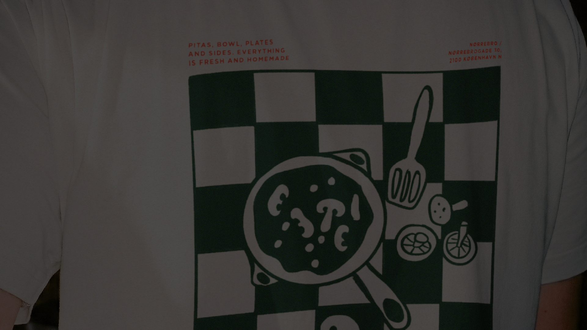
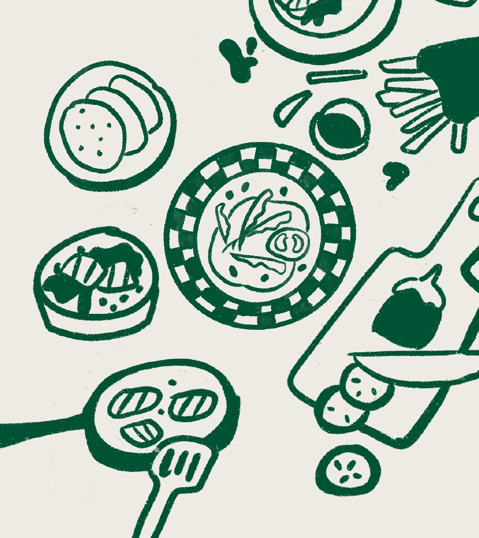
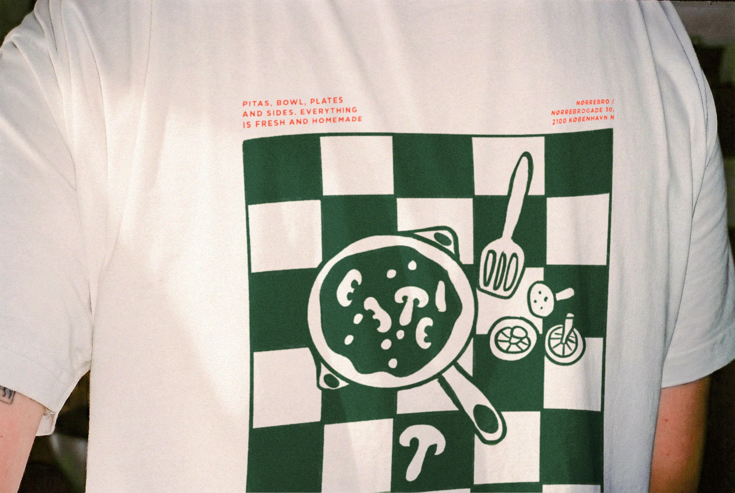
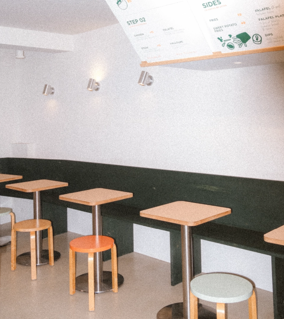
From there, we built a fast-casual identity around the idea of simple things done with intention. The visual language is warm, expressive and uncomplicated, reflecting the way Banzo approaches food. Clean gestures, honest shapes and playful illustrations create a world that feels fresh and familiar at the same time. At the heart of the expression is a handwritten font, rooted in the idea that our handwriting is one of the most personal things we have. It brings a human quality to the brand and gives each touchpoint a sense of character, warmth and individuality. Just as every Banzo location reflects something of its local surroundings, the handwriting gives the brand room to feel personal rather than perfectly polished.
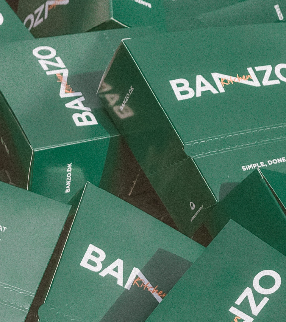
The logo brings this thinking to life through a custom wordmark inspired by the physical qualities of dough. Its flexible, stretched form introduces movement and softness into the identity, creating a distinctive asset that can adapt across different formats and touchpoints. Like the dough itself, the logo can stretch, shift and take on different forms while remaining recognisably Banzo.
The wider identity was designed for the rhythm of a fast-casual environment. From storefronts and menus to packaging and everyday communications, the system creates a consistent experience without becoming rigid. It gives Banzo the flexibility to move, adapt and grow while keeping its character intact.
Across every touchpoint, the same principle carries through. Start with the basics. Give them room to evolve. And shape them into something new.
Deliverables
• Brand Strategy
• Naming
• Brand Identity
• Illustration System
• Packaging Design
By evolving Garbanzo into Banzo, we helped shape a brand that feels as fresh and effortless as the food it serves. A fast-casual identity built around simplicity, flexibility and character. One that can evolve with the food, the space and the people it serves, without ever losing sight of the basics that started it all.