Show case text

Crave it. Eat it.
Feel SNACK’d.
Crave it. Eat it.
Feel SNACK’d.
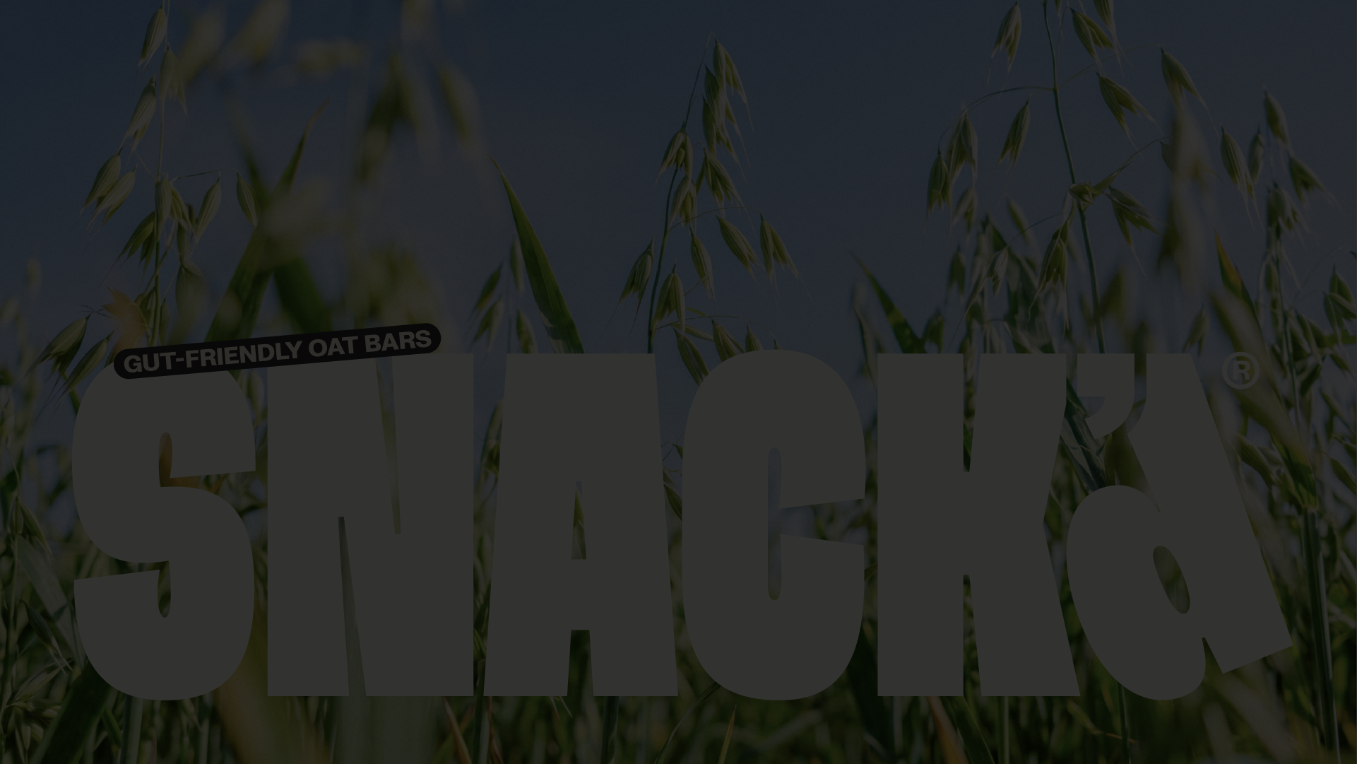
SNACK’d was created around a simple idea: better-for-you snacking should not mean settling for less. Made with 100% British oats and designed for a more inclusive way of eating, the brand had a clear ambition. But in a category crowded with soft colours, wholesome language and predictable ideas of what healthy food should look like, there was an opportunity to do something different. To make healthy feel less well-behaved.
We identified a core challenge. SNACK’d had all the right reasons to exist, but needed a distinctive voice and visual world that could make those reasons felt. The brand needed to move beyond the conventions of better-for-you food and create a presence that was confident, energetic and unapologetically itself. Something that could stand out on shelf, but also build a stronger connection with a new generation of snackers.
Starting with strategy and naming, we defined a positioning rooted in the idea that better choices do not have to feel like compromises. The name SNACK’d is direct, playful and conversational, giving the brand a sense of immediacy and attitude. From there, the identity was developed to make healthy feel less restrained and more expressive.
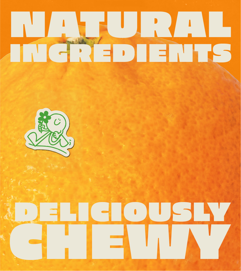
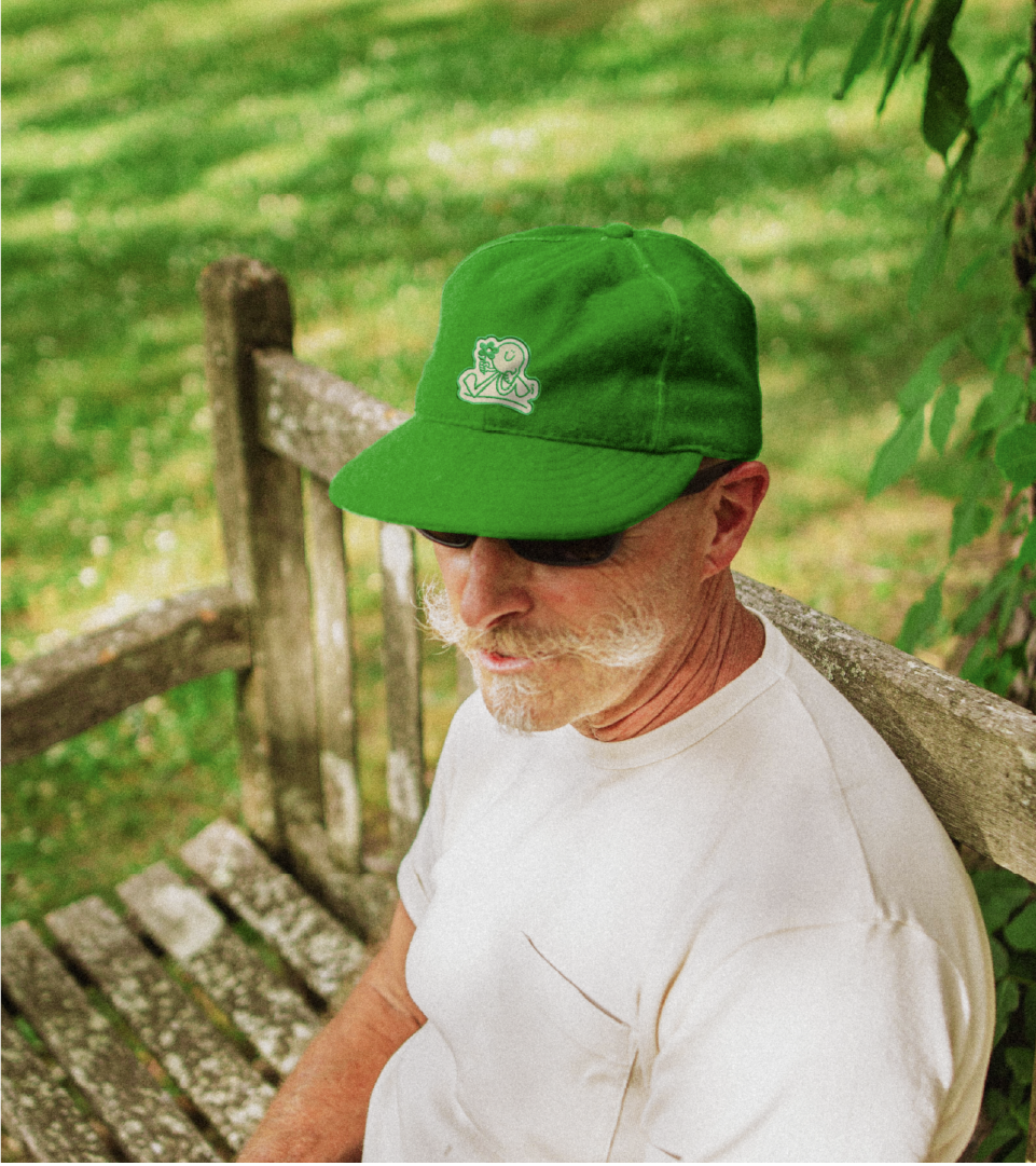
The visual identity embraces bold typography, unexpected combinations and a graphic language with plenty of energy. Rather than relying on the usual cues of health and wellness, we created an expression that brings food closer to how it should feel: a fun, uplifting experience that nurtures both body and soul. The result is a system that can be loud when it needs to be, but always remains clear, recognisable and full of personality.
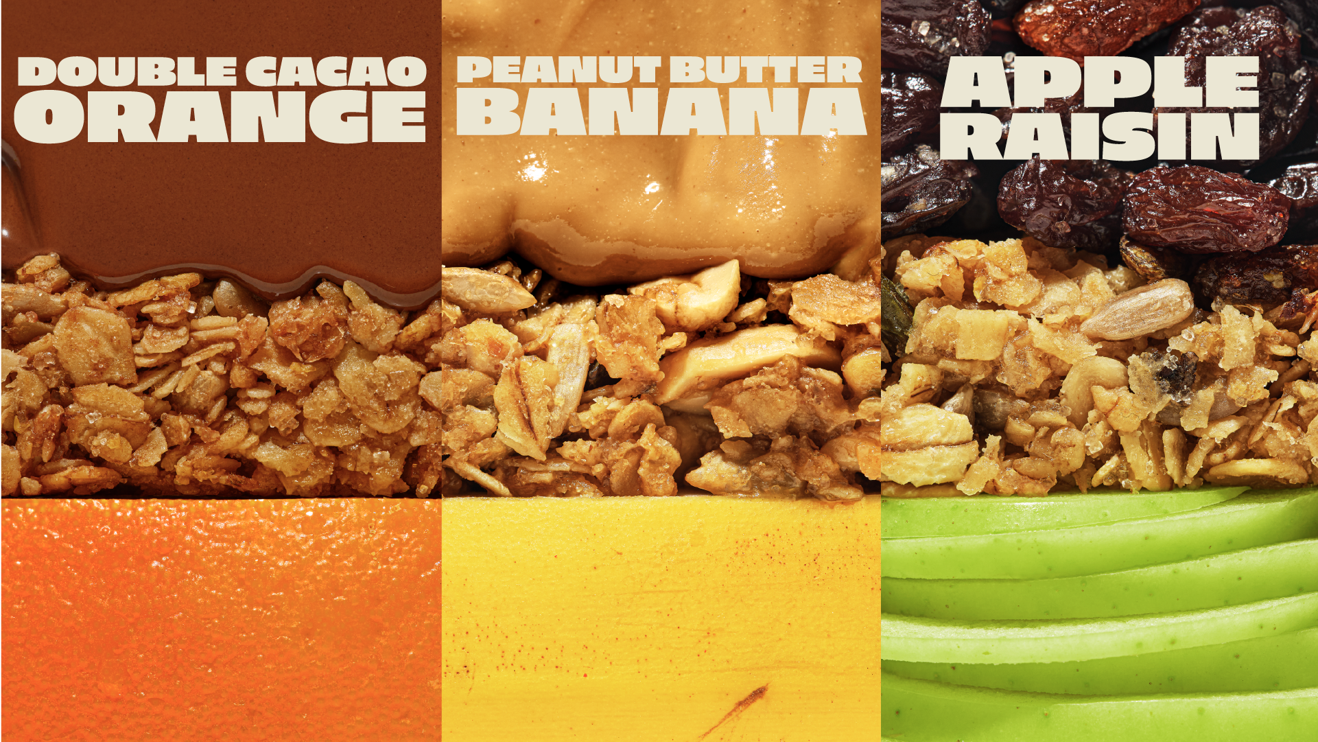
Packaging became the most immediate expression of this approach. Designed to disrupt the category rather than blend into it, each pack uses colour, typography and graphic elements to create a strong visual rhythm across the range. The system gives every flavour its own character while keeping the wider family instantly recognisable. It is a packaging language designed to catch attention first, then reward a closer look.
Across every touchpoint, the same principle carries through. SNACK’d is healthy, but it does not need to behave like healthy. It can be bold. It can be playful. It can have attitude. It can make a better choice feel like the choice you actually want to make.
Deliverables
• Brand Strategy
• Naming
• Brand Identity
• Packaging Design
By challenging the conventions of better-for-you snacking, we helped SNACK’d build a brand with a sharper point of view and a more distinctive presence. A brand that does not ask people to compromise when they choose better. It simply makes better feel more exciting.